Creating responsive emails has almost become a mandate as more and more people are accessing their emails over mobile devices. Nearly 46% of all email opens were recorded on mobile devices. 35% of business professionals use their mobile phones to check email. These statistics have made it evident that email campaigns ought to be created by considering mobile subscribers. Your emails must impart a flawless customer experience, regardless of the device they are using and its screen size. Responsive email designs come into the picture here.
What is Responsive Email?

An email designed with the help of fluid tables, fluid images, and media queries to ensure its layout across the diverse devices is known as a responsive email. The CSS media queries help in changing fixed-width tables and images designed for desktops into fluid elements for smaller screens.
Points to Consider While Designing Responsive Emails
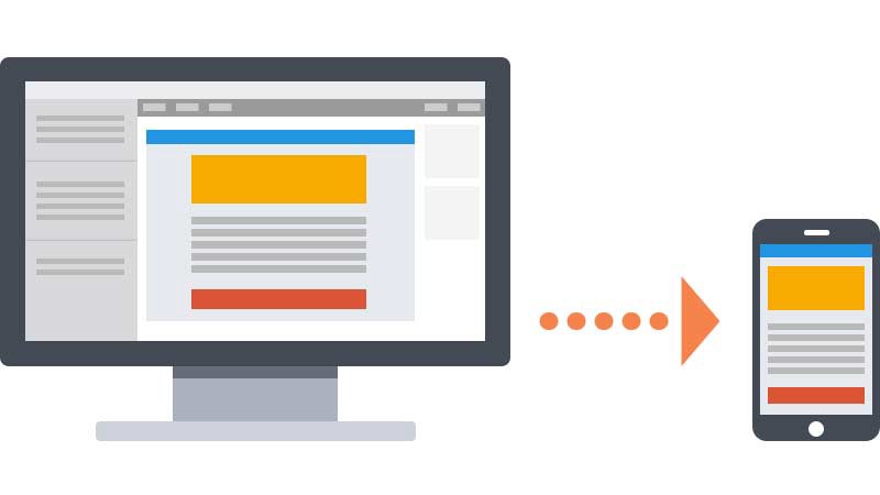
- It is advisable to design emails with 600 to 640px width and single-column layout for mobile devices so that they are easily readable.
- Whenever you are using any visual elements, compress them to the minimum file size possible.
- Check the ESPs you are using for your email campaign who support responsive email templates Mailchimp, Pardot, Marketo, etc.
- Your subject lines should be fewer than 50 characters with an engaging preheader text.
- Refrain from having any navigation bars in emails.
- According to guidelines published by Apple, the size of links and buttons should be 44×44 pixels for subscribers to be able to tap easily.
- The font size of your titles should not be smaller than 20-pt. Your body text must be kept at a minimum 13- or 14-pt font.
- Your primary call-to-action and most important information should always be placed “above the fold”. Your subscribers should be easily able to understand what you want to convey without having to scroll too much.
- Use big, tappable buttons instead of unnecessary hyperlinks to make sure that the recipient does not end up clicking on the wrong link.
- You must have smaller, responsive images or consider using images at 2x for retina screens.
- Add suitable alt-text to go with the visuals so that the subscribers can understand the purpose of the email even when the images are blocked in their email client.
- Do not forget to test your email. You can use a tool such as an Email on Acid or Litmus to check the preview of your emails on different email clients and devices to ensure flawless rendering.
- If you are using grids, you might have to think of an alternative for Outlook subscribers.
- Always use px rather than EM.
- Make sure your email landing pages are responsive.
How to Create Mobile Responsive Emails

While web designers use stylesheets or Cascading Style Sheets for creating responsive websites, emails work differently.
Some of the popular email clients block external stylesheets and so we have to use either of the two options discussed below:
- Embedded styles within the head tag of an email placed in a style tag
- Inline styles within the email body
Coding a mobile-responsive email should include both these elements because some email clients will not consider the embedded CSS placed inside the <head> of the HTML code. In such cases, the inline style makes sure that your emails render well, irrespective of the device on which they are accessed.
Take a look at the basic stylesheet that includes embedded CSS as well as inline styles.
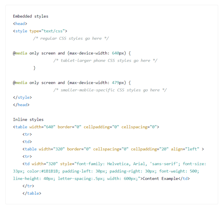
In the screenshot above, an @media declaration is created, taking into consideration mobile-specific CSS styles.
To elaborate, @media only screen lets the email client know that the email must be displayed on a screen.
max-device-width specified the requirements of the device’s viewport.
According to the example presented here, the viewport cannot have a width of more than 640px and 479px. Subsequently, the email will be displayed according to these specifications after adjusting the image and text sizes. You can have two breakpoints to modify the elements in your email so that the email renders well even on tablets with a bigger screen size.
On the other hand, inline styles work as the fallback for CSS when email clients remove the <style> tags from the <head> of the HTML document. Inline styles allow you to set the width, font size, and weight, or font family. Take a look at how we have specified the font, padding, and color properties by using style= in the <td> tag.
Two-column Layouts
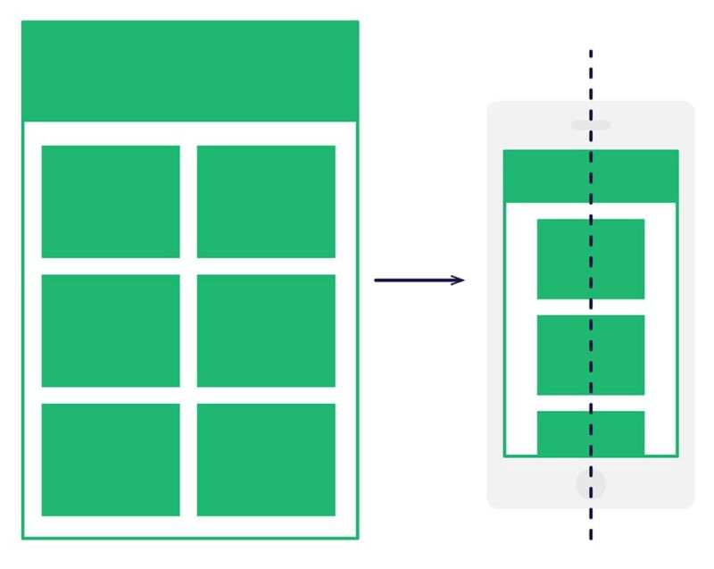
Usually, mobile responsive layout works well with one-column HTML email templates like ones from Email Uplers. However, you can also create two-column responsive layouts even without using mile-long stylesheets in media queries.
The downside to these two-column layouts is that they are not easily readable on mobile devices even though they can accommodate more information on desktop email clients above the fold.
This can be resolved by using a magical formula:
Avoid using CSS and take the help of HTML attributes. This is because email clients might not support CSS but they are well compatible with attributes.
For instance: Instead of using CSS codes like float: left and padding: 10px, you must use align=”left” and cellpadding=”10”.
Using Media Queries to Target Devices
Most commonly, we use @media only screen and (max-device-width: 640px) { … } and @media only screen and (max-device-width: 479px) { … }.
It is recommended to use these media queries for Apple iPhones and some other handheld devices comprising the popular email clients.
In case you want to target tablets or larger-screen Android devices, you will have to use unique media queries as well as unique styles.
Wrapping Up
The world of mobile devices is as dynamic as email. These tips are just the basic tactics that can help you in creating responsive emails. The key is to test and look for loopholes so that your subscribers can have a smooth experience whenever they open your emails.


