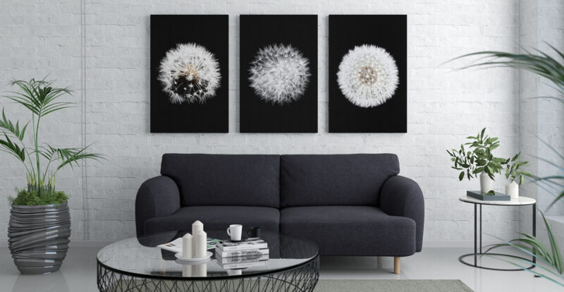
Choosing wall art can often feel so stressful because it tends to be the ‘final touches’ on a room. Wall art prints can also help us express our personality, tie aesthetics together and capture the mood and purpose of a room.
The problem is that you can’t be certain what a piece of art or decor is going to look like until you get it home. Well, according to The House Outfit tips will help you to perfect buying wall prints for your home and office.
Think About The Framing
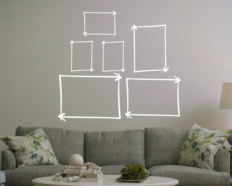
Frames always seem like an afterthought when you’ve finally found the piece of art or print that perfectly compliments your space, and we’ll get to that in a minute. But frames will make or break the impact the addition has on the room.
Firstly, you need to decide if you want a window mount within the frame. A window mount is essentially a border inside the frame, typically they are white. They can add a very sophisticated, clean edging to a piece of art. If you’re going for bold, bright colours, window mounts can also work for you to ensure things aren’t overwhelming and to prevent colour clashing. In turn, if you’re looking to achieve a ‘wallpaper’ effect with your wall print (without having to actually put up wallpaper), then going without a mount can help the piece look flatter to the wall. It’s more often used for much bigger prints and art pieces, for example, above A3.
Secondly, you need to think about the frame colour. Frames are going to be an accessory in the room and should work with the accessory colours you are trying to pull through in the space. As a general rule of thumb, you should either go for frames that are all the same colour or completely mix and match it. Having a few in white, a couple in black and some random wooden frames will look untidy – and not in an aesthetic ‘eclectic’ way. A little forethought about your frames could help to bring the whole room together.
Choosing Colours Of Prints
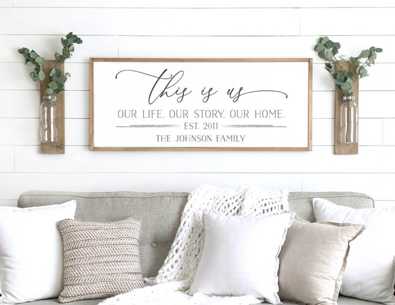
There tends to be two ways of shopping for art and prints. Either you just happen to find something in a shop that you absolutely have to have or you’re hunting online and in store and nothing is speaking to you.
If you’re struggling with the latter, the best way to shop is often by colour. Look at your room (ideally at different times of day to get an idea of different lighting) and think about which colours will compliment your existing decor and which colours you’re looking to bring out. Then, you’ve narrowed down your search. Shopping this way helps to avoid buying something you absolutely love but does nothing to help your room and ends up being wasted money.
If you’re starting with a blank canvas and aren’t really sure on your colours yet, then think about themes or styles you tend to lean towards. For example, industrial, kitsch, luxe, eclectic etc. This may help you to narrow down your search, too.
Available Wall Space
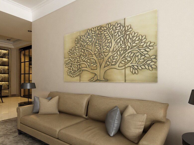
This is perhaps the most important step of choosing art or prints – or hanging anything on walls at all.
You must think about the wall space available but remember – not every bare wall has to have something on it, but more importantly; not every wall print is going to work in the space available.
For example, putting a square print at eye level on a small wall is likely to make the space look busy and cluttered. This is because the print or art looks like it’s been crammed into a small space. It’s better to put art on the bigger walls in your space, rather than clutter up the smaller ones.
Also consider the orientation of the wall art you’re considering. Will it sit in portrait or landscape? If you have a smaller space, it’s better to opt for a portrait piece. This is because it creates an optical illusion and can help to draw the eye upwards, rather than minimising the wall space.
The plan and shades of your room can impact your mind-set and rest designs. In the event that you are not happy with your room stylistic layout, consider utilizing divider craftsmanship as an option in contrast to expensive refurbishing or remodel.
Solace and serenity are equivalent with regards to planning a room, yet this doesn’t mean you need to do without a tastefully satisfying room. Albeit splendid, striking tones are not helpful for rest; with divider craftsmanship, you can consolidate a couple of pieces without burning-through the room, while as yet communicating your own style.
For the individuals who favor more quieted and regular tones, divider craftsmanship is accessible in an assortment of mediums, surfaces, strands and shadings. Common and straightforward doesn’t need to be exhausting.
Texture as Wall Art
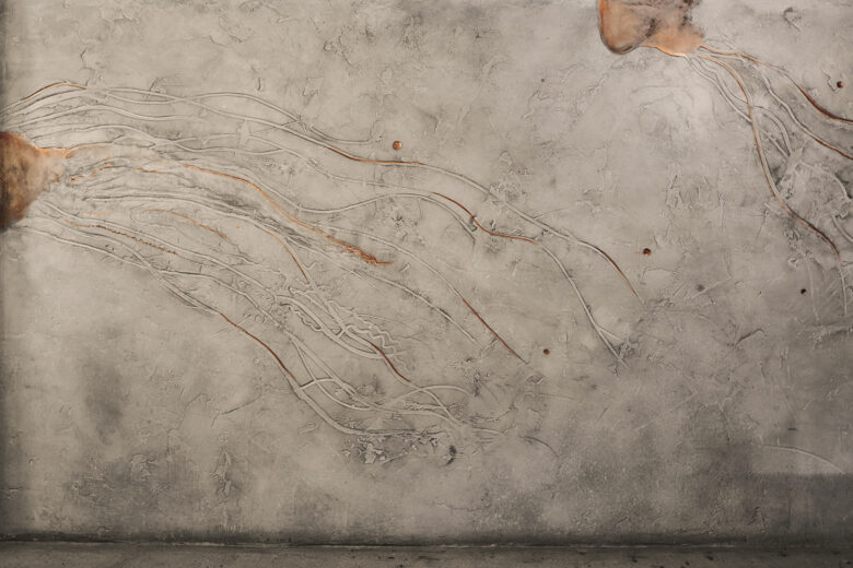
Textures are a noteworthy method to add tone and surface to your room. Divider woven artworks and texture craftsmanship pieces give extraordinary central focuses that can breath life into a room in a second. Embroidered artwork and texture materials range from breezy, light, normal strands to those that signify class and erotic nature. The present texture divider craftsmanship need not look like your grandma’s parlor floor covering.
While curtains are regularly viewed as window medicines, they can likewise be a statement of divider workmanship. The accessibility of prints, tones and surfaces, in mix with ornamental poles can definitely change the air of a room.
Paint as Wall Art
The expansion of a painted painting can likewise change a room. On the off chance that you are on a strict spending plan, you might need to take a stab at making your own interesting wall painting plan. Novices might need to zero in on straightforward plans.
Stencils are likewise a great method to add individual style to a room. Rich plans, when set appropriately, can make the fantasy of a bigger, or separated space. Stencils are likewise a pleasant method to add character to a kid’s room. Maybe use something from paintingkits.net where you can find a great DIY project.
Divider Art Décor
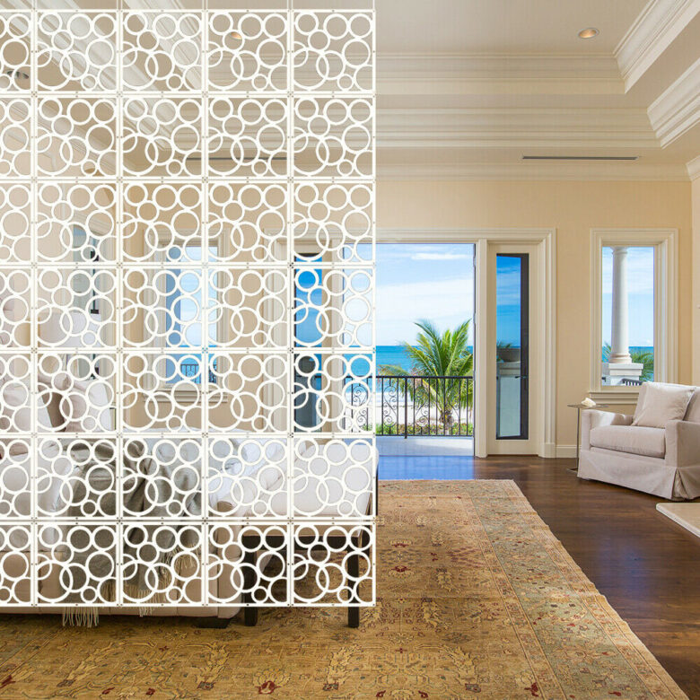
Canvases, prints and photos are little contacts that can customize your room. On the off chance that you lean towards a more erotic stylistic layout, have a go at utilizing elegant, imaginatively motivated arousing prints or photos.
Botanical and nature scenes can likewise light up a dull room. In any case, prints and works of art that are too intense and splendid frequently assume control over a room. While you don’t need colors that mix into the dividers, you pick colors that praise and differentiation your plan.
Lighting as Wall Art
Divider sconces are accessible in an assortment of plans and shadings that range from sentimental to current. Rather than brutal overhead lighting, the sconces grant a milder, aberrant light that radiates from the divider.
Furniture as Wall Art
Racking and reflects are a cheap method to change the vibe of a room. Mirrors can cause a space to show up more open. Racking can be practical, just as fun. Little retires can hold everything from bloom jars to photos.

