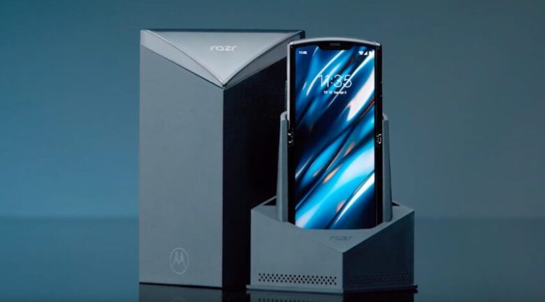
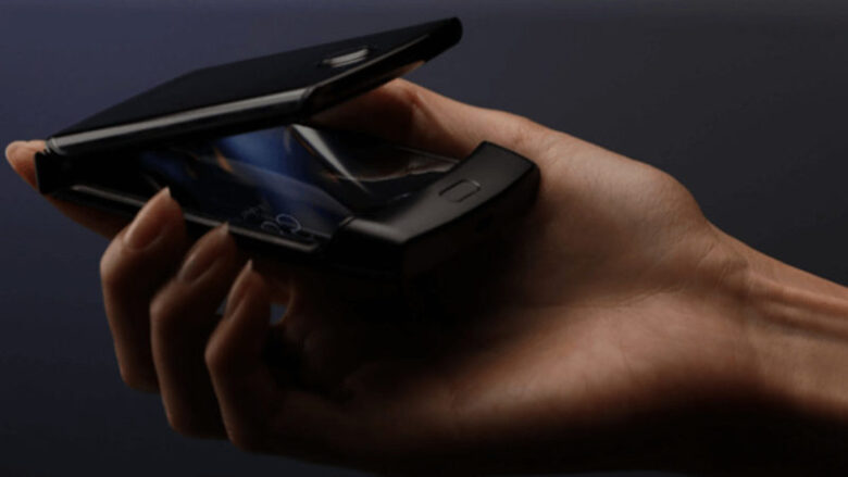
Motorola says it didn’t set out to recreate a legend when it started designing Motorola Razr phone four years ago. It’s just that sometimes the best ways are the old ways.
Samsung’s Galaxy Fold might have been the first with a flexible display in the U.S., but there’s more than one way to fold a phone.
While the Galaxy Fold is more like a tablet that collapses to a chunky candy bar, the Razr is a new take on the clamshell phone. When it’s open you get a tall 6.2-inch plastic OLED display, that reminds a lot of Sony’s latest Xperia’s. It’s 21:9 aspect ratio is ideal for cinematic video and reading long documents with a minimum of scrolling, and it’s easier to use one-handed than a wider display would be.

It’s bordered on the top by a notched, five-megapixel selfie camera, which is meant mainly for video calls, and on the bottom by the Razr’s signature chin.
The chin is also functional, it’s where you’ll find the speedy fingerprint sensor, as well as the 4G LTE antennas. No 5G this time around. Also in the chin, a big resonator for the new speakerphone. Motorola is known for its great audio quality, but the hands-on venue seems pretty noisy.
Motorola worked with Lenovo’s laptop team on foldable Razr design, which lets the screen curl, in a sort of teardrop, when you shut the phone.
Flexing and sliding down into the chin by a millimeter lets the stainless steel casing close completely around the screen, which makes it tougher for the dust to get it in there. And it, also, avoids a sharp, tight kink that might cause a crease to form on the screen.
On that subject, it’s not the uniform perfection of a glass display but the Razr’s is much flatter and less variegated than the Galaxy Folds.

Motorola also applied its usual nano-coating to the panel, so it’s water-resistant. But certainly, with these big gaps in the sides when you open and close it you shouldn’t take it anywhere near the beach. Motorola although really doesn’t seem worried about it, which says a lot.
While the primary display is the main attraction, Razr got one on the front too, and Motorola calls this 2.7 inch OLED touchscreen a Quick View display because it’s here just for the basics.
It’s kinda like a smartwatch, you can preview notifications, make and take calls, use Google Pay and Assistant or control your music, all using the same Moto Display actions. The useful and addictive Motorola gesture shortcuts are here too. Chop it to turn on the flashlight, twist it to launch the camera.
The camera is where it can be seen that Motorola locked in the Razr components a long time ago. You have to make do with a single shooter, no ultra-wide or telephoto and the sensor is the same one found in the OnePlus 6.

The spec sheet is full of similar compromises.
The processor will be almost two-years-old when this phone launches.
While 128 gigs of storage is a fair amount of space there’s no microSD expansion, nor is there a SIM slot.
If you want to use this on any carrier other than the exclusive launch partner, Verizon, you’ll need to take it to a competitor with the compatible eSIM format. The volume and power keys on the unit don’t feel great, almost any travel or feedback.
The plastic back might suggest wireless charging but that’s not here, just wired 15 watts charging through the USB-C port.
And on top of that, the battery is only about 2500 milliamp per hour, that’s 10% smaller than the battery in the Pixel 4, which is known that has bad endurance.
The units are currently running an Android version behind, though Motorola does promise an update shortly after launch to Android 10.
That’s a lot of compromises for $1,500, which is what this will cost when it goes on sale in January.


