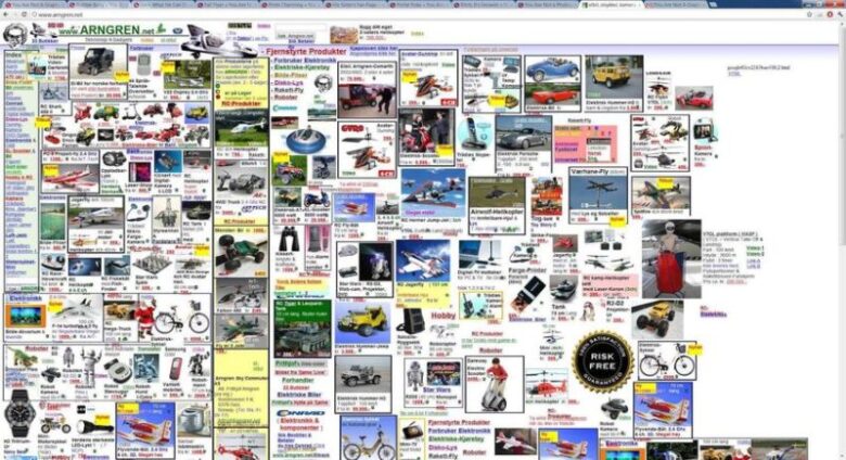
Have you ever come across a website that looks cluttered? Have you ever visited a site that has a weak color contrast and unreadable text? How about the one that goes overboard with pop-ups? Yes, right. We come across such a site frequently. This clearly shows that web design is intricate and very few designers manage to hit the nail on the head.
There is no “one size fits all” formula in web design so you cannot tell anyone to follow certain golden rules and succeed. What’s more, a design you like might not get the same reactions from others. This makes the web designer’s job even more difficult. They have to create web designs that most people would love and that’s not easy to do.
For professional web design service, check Ramotion.

To help you out in overcoming all these challenges, Branex has created a list of the seven biggest sins of web design so you can avoid them.
Typographic and Color Chaos
Imagine visiting a website and greeted by a mix of flashy colors. You scroll down to read the content on the web page and get another unpleasant surprise, unreadable font. The background color and text color or size make it unreadable. Would you stay on such a page for any length of time? No, right. The same fate awaits you if your site is using too many different fonts and colors. Stick to two to three colors and apply the same rule on typography.

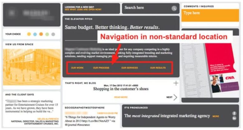
Confusing or Hidden Navigation
I don’t know about you, but I have seen web pages that use complicated and hidden navigation. Imagine a scenario where your visitors land on your site to get the desired information but could not figure out a way to navigate to the desired page. He or she will go back and visit any other place, which can of your competitor too. Breadcrumb navigation menus might work great on mobile, but it is not a good option for desktop. Use prominent navigation buttons and place it as a famous spot so that the visitors can easily see it and navigate your website without any hassle.

Cramming Everything On A Web Page
The way you organize different elements makes a huge impact on user experience. Make sure you arrange these elements in a way that it does not look cluttered. Eliminate all the unnecessary stuff that is lingering on your website and give it a cleaner and simpler look. Surround elements you want your users to focus on with white spaces and attract their attention.

By using white spaces cleverly, you can make your website easy on the eyes without compromising on the functionality. Try to keep your webpage as simple as possible. A cleaner-looking website makes your business look more professionals in the eyes of the users, which is precisely what you want your users to think about your business. Leonardo Da Vinci summed it up brilliantly when he said, “Simplicity is the ultimate sophistication.”
Pop Up Galore
Your website is generating a lot of traffic but no conversions. Your marketing team will tell you to add more pop-ups. Yes, pop-ups might increase your conversion rate, but that does not mean that you should bombard your website visitors with pop-ups. Pop up hampers the user experience by stopping the users in their tracks. That is the reason why search engines like Google are penalizing websites that use too many pop-ups. Even if you want to use it, make sure you use it sparingly and smartly. Make sure that it does not cover the content on the page.

Useless Animations
Another important thing that is usually considered great to keep the users engaged is animations. Just like pop-ups, if you use animations too much, it kills the purpose and proves to be counterproductive. It can distract your visitors instead of engaging them and becomes an eyesore for them. There is nothing wrong in using short videos, subtle movements, image hover states and exciting animations. These deft touches can go a long way in improving the user experience, user engagement and creates exciting interactions, as long as you don’t go overboard with it. If used cleverly, animations can help you control user attention and attract their attention towards a specific element.
Using Poor Quality Images
Stock photographs have long been a go-to option for many sites. Using low-quality photos on your website can leave a bad taste in the mouth of your visitors. They will consider you as unprofessional and will never do business with you. As a business, you don’t want that. That is why it is important to create your custom image. When you use unique images, it will make your page stand out from the crowd and users will certainly take notice.

Not Having a Call To Action
Why are you in the business? To earn a profit, right. Why do you want to generate more traffic to your website? Because you want to convert them into paying customers, right. By not having a call to action, you are missing out on this opportunity. Make sure that your call to action is prominently visible and placed at the right spot so that users can easily click on it.
Tie your call to action to a valuable offer that your target audience cannot resist. It can be a simple template, E-book, or a discount coupon that they can unlock by entering their email address or phone number. This allows you to establish a contact point with them in the future. Don’t forget to mention your contact details on your website so that your website visitors can reach out to you through phone, emails, or other means.

Which is the biggest web design sin you have ever committed? Feel free to share it with us in the comments section below.


