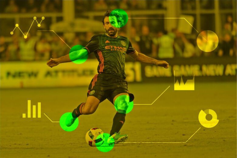
In sports analytics, football holds a special place due to its dynamic nature and the passionate following it has worldwide. The advent of football APIs has opened up a treasure trove of data, offering insights into every conceivable aspect of the game. However, raw data, while rich in information, can be overwhelming.
This is where the art of data visualisation comes into play, transforming complex datasets into compelling, easy-to-understand infographics. This blog post explores how to bridge the gap between raw football data and engaging visual stories.
Understanding football APIs

Football APIs serve as gateways to vast amounts of data, from live scores and player statistics to team formations and match events. These APIs collect real-time data, providing a comprehensive view of matches as they unfold. For developers and analysts, these APIs are invaluable tools for accessing up-to-date information without manually compiling data from various sources.
The challenge of raw data
While football APIs offer detailed insights, the sheer volume and complexity of the data can be daunting. Raw data, typically presented in JSON or XML format, requires significant processing to become understandable to the average fan. This is where data visualization steps in, offering a solution to present this data in an accessible and visually appealing format.
Principles of effective data visualisation
Effective data visualization is more than just creating visually appealing graphics; it involves presenting data in a way that communicates information clearly and efficiently. Here are some key principles to consider:
– Simplicity: Avoid clutter and focus on presenting data that adds value to the story you want to tell.
– Relevance: Choose visualization types (bar charts, line graphs, heat maps, etc.) that best represent the data and make it easy for the audience to grasp the insights.
– Accuracy: Ensure that visualizations accurately represent the data, avoiding misleading representations or exaggerations.
From APIs to infographics

Creating compelling infographics from football API data involves several steps, starting with identifying the story you want to tell. Whether it’s analyzing a player’s performance over a season, comparing teams, or highlighting key moments in a match, the story drives the visualization process.
- Data extraction: Use football APIs to gather the data relevant to your story. This might involve fetching data on player statistics, match outcomes, or historical performance.
- Data processing: Clean and process the data to focus on the information that supports your narrative. This step might involve aggregating data, calculating averages, or identifying trends.
- Design and visualization: Choose the right visualization tools and design elements to bring your data to life. Tools like Tableau, Adobe Illustrator, or even simpler options like Canva can be used to create infographics that are not only informative but also engaging.
- Narrative building: Integrate your visualizations into a coherent narrative that guides the viewer through the data, providing context and insights that make the information meaningful.
Advanced Data Analysis Techniques
To derive more profound insights from football data, advanced analysis techniques such as machine learning and predictive analytics can be employed.
These methods can help in identifying patterns, predicting match outcomes, and analyzing player performance at a granular level. For instance, machine learning algorithms can forecast a player’s future performance based on historical data, aiding in talent scouting and team strategy.
Visualization of these analyses can be particularly compelling, using complex graph plots like scatter plots with trend lines or heat maps to indicate player movements and field hot-zones.
Interactive Visualization Tools
The evolution of web technologies has brought about interactive visualization tools, which allow users to explore data in a dynamic and engaging manner.
Platforms such as D3.js and Plotly offer capabilities to create interactive charts and maps that respond to user inputs, enabling a more personalized exploration of football data. For example, interactive dashboards can allow fans to filter data by team, player, or match to find specific statistics, enhancing user engagement and understanding through interactivity.
Storytelling with Data

The art of storytelling with data goes beyond mere visualization; it involves weaving a narrative that captures the audience’s interest and guides them through the insights.
This can be particularly effective in sports analytics, where each data point can contribute to a larger story about a player, team, or league. Incorporating elements such as player profiles, match highlights, and historical context into infographics can create a more immersive experience, making the data not just informative but also compelling.
Best Practices for Data Visualization in Football
To ensure that football data visualizations are both impactful and accessible, adhering to best practices is crucial. This includes using consistent color schemes and visual elements for team or player identification, employing clear and concise labeling, and providing context for the data presented.
It’s also important to consider the platform where the visualization will be displayed, as mobile devices may require different design considerations than desktop displays.
Moreover, feedback from the audience can offer valuable insights into how visualizations are perceived and understood, enabling continuous improvement.
The art of transforming football data into engaging infographics is a meticulous blend of analytical precision and imaginative storytelling.
By harnessing the power of football APIs, such as the Sportmonks API, to tap into extensive datasets, and applying fundamental data visualization techniques, both enthusiasts and experts can disclose captivating stories hidden within the numbers. This process not only normalizes access to the intricate world of football analytics but also enriches the viewer experience, allowing fans of all levels to explore and appreciate the game’s depths.
Whether you’re deeply invested in football’s analytical side or simply enjoy the sport’s narratives, the strategic use of infographics powered by comprehensive sources like the Sportmonks API can significantly enhance your understanding and enjoyment of football.

