Google has one of the most recognizable logos on earth, and not to mention, the most important. And it only consists of the search engine’s name in blue, red, yellow, and green. It exudes simplicity but remains iconic. Even those who favor other search engines will instantly recognize Google’s trademark design.
Google’s logo features design fundamentals that anyone can use. Indeed, if you want to build a powerful brand that distinguishes your company from its rivals, follow Google’s lead. Through Google’s design philosophy, you’ll see how to create and use your own logo for maximum results.
1. Don’t Fear Change

You don’t have to keep using the same logo year after year. It’s worthwhile if your company symbol alters a bit, especially on special occasions. Also, modernizing your logo’s appearance can positively boost your advertising efforts. If your company’s mission or focus changes, alter your logo to match. After all, it’s often the most distinguishable feature of your business.
Google has modified its emblem several times. Upon its first introduction in 1997, twisted and slanted letters sprawled across the page. In retrospect, the basic 3D effects seem humorous. However, Google’s latest logo is clean and crisp. It’s been updated to match contemporary graphic design and indicates a cutting-edge company. If the logo had never changed, it would have never grown to be the giant it is today.
2. Stay Consistent
As you celebrate an update, remember that consistency is essential. Any logo modifications should have some type of consistent aspect. No variations should ever stray from the company’s established identity. Whether it’s a uniform color range or font, you want your company to remain identifiable.
Google has implemented its own modifications over the years. However, you’ll notice the same use of multicolored letters. Your business logo is most effective with minor adjustments to a consistent structure. This structure helps your audience connect the new emblem with your company’s same vision and commitment. Modernize your logo to attract new customers and keep a foundation that ensures your current customers’ loyalty.
3. Keep it 2D

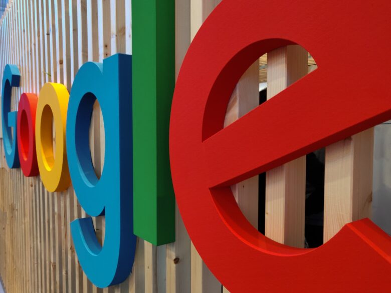
Dimension is not the priority it once was decades ago. During the 1990s and early 2000s, 3D features were on-trend and widely favored. 3D effects like bubbled or shadowed letters are no longer the pinnacle of design. In fact, avoid them altogether. This kind of effects has left this space and a new one has emerged. These days, designers are known to use a level or flat design.
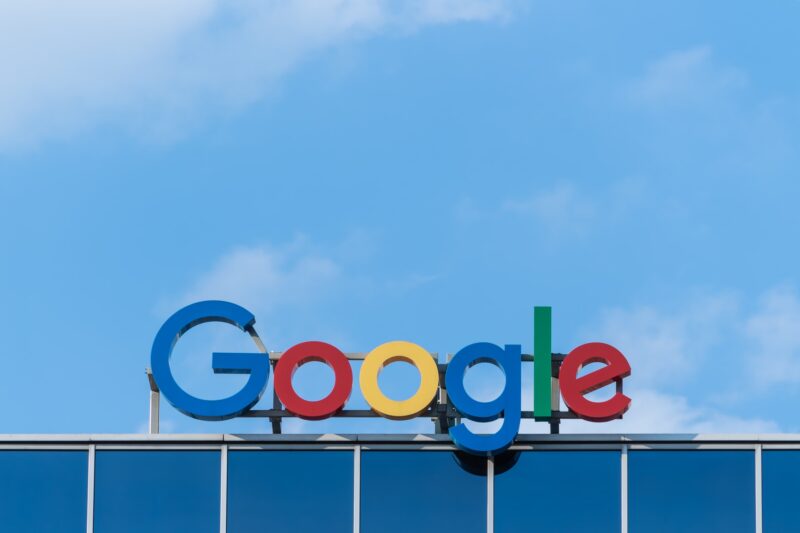
Since that time, graphic designers have transitioned to less of a focus on depth and dimension. Currently, businesses typically use 2D designs. Even Google’s current logo is flat with even lettering. Your company will benefit more from using an evenly-appearing technique. It coincides with modern design features and is more appealing to your customers.
4. Choose Typeface Wisely
Business logos abound in both serif and sans-serif typefaces. While similar, the preferred typeface is sans-serif. It’s best for a professional logo because it features clean, and clipped letters. Serif style letters feature slight projections at the edges. You’ll find that some typography styles finish on a curved note, while others finish with straight bars or lines. The additional embellishments can drastically change the impact of a logo.
Sans-serif typefaces have cropped edges with no embellishments. In 2015, Google moved to sans-serif and dismissed serif. Remember that font matters when designing your company’s logo. Whether you create a font style or select an existing one, use Google’s choice as your own. The crisp, clean look will be more appealing to a diverse audience.
5. Scalability is Critical

The appearance of your company design depends on how your audience views it, that’s always the rule here. The display device or format and logo size are equally important. Your logo must be scalable for various formats and applications because without it, your audience will automatically dislike your logo. Twenty years ago, scalability wasn’t a massive concern because consumers viewed most digital advertising on a large desktop computer screen.
Now, large monitors still exist, but smaller devices are in the mix. Most people have smaller laptops or even smaller tablets. Some customers may even view advertising on a screen as little as a watch face. If your logo lacks scalability, customers will have difficulty understanding your design or recognizing your brand. Google’s depiction is apparent no matter the viewing device. The company has undoubtedly nailed scalability.
6. Vibrant Colors Get Attention
Another Google design element to emulate is the use of color. Unsurprisingly, bright shades catch more attention than dark ones. Take a look at Sharp Suits, their funny logo collection screams vibrancy. A logo using vibrant colors will stand out much more than a logo using dark or muted tones.
Google uses bright, primary hues that look rich in any form. Other companies have followed suit. In fact, Microsoft moved away from an all-black layout in 2012 to an emblem featuring brighter colors. Your logo doesn’t have to utilize all the rainbow hues, but a splash of color can set your brand apart from its competition.
7. It’s Launch Time

After designing your company’s logo, it’s time to introduce it to the world. Google launches design variations methodically but tends to focus on times of grand celebration or great mourning. The company’s latest large scale logo change came in 2015. With the new typeface, Google also introduced a blue “G” trademark.
While your logo doesn’t have to feature quite so many variations, you can still carefully choose your launch time. You might even center a marketing campaign around the release of a new logo which is a better way of testing the waters first. Just make sure you update the design across all platforms at once. Consistency in the launch is necessary, just like consistency in your design is essential.
Regardless of when you want to introduce a new logo, now is the time to start the creative process of a redesign. Google is proof enough that these principles work. Follow the company’s design lead and see the benefits of a healthier, more profitable brand for your own business.

