The business card remains an enduring marketing tool because these little pieces pack a powerful punch, and they don’t cost a fortune either. In the modern age of digital communication, it is easy to overlook the business card and just view it as a tool for the exchange of contact information, but it actually has far more potential than that.
Make your business card your constant companion

You should never leave home without your business card, whether you are going out for work or leisure – you just never know when you might need it. Here are some tips to make it stand out from the crowd all within a space no greater than 3.5 x 2 inches.
Business card marketing success
Explain what you have to offer

You can’t write a book as space is very limited, and most people don’t want that anyway, but your it should tell people what you do. You might be surprised at how many business cards don’t actually make that the first thing to jump out at the reader. If people have to think about what you do or work it out, then they will instantly lose interest – you have one chance to make an impact, so use this wisely.
Hopefully, your company name or title explains what you do; if not, you will need to a few words, and ‘few’ is the operative word here. Less is definitely more. If you are an employee, then usually your job title is sufficient to convey this information, but with your own business, you can just add a tag line or header to get the point across.
For example, if you were running a cake making business, then you could say, “fresh ingredients, free delivery,” and if you were a beautician, then “evening and weekend appointments available” is a particularly appropriate tag line. If it is self-evident, then you can add other information such as, “best local business award winner” or some other accolade or relevant detail
Include food for thought or a call to action

These are the kind of techniques that elevates your card above the level of an entry in an advertising directory. Try and include an inducement or enticement so that people get in touch. Some popular phrases might include “free consultation with this card, worth £50” or “visit our website for current special offers” or perhaps, “free no-obligation site survey and quotation.”
Some people just don’t run that type of business, so you could instead include a quotation or something humorous or even a statistic. The whole idea is that what you add to the card should pique interest and create some level of colour and personality, so even if people don’t get in touch immediately, they will remember you and call when they do need you.
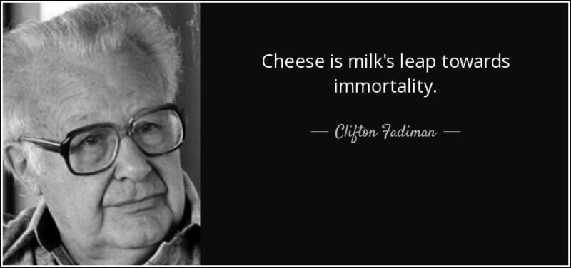
How about, “Cheese – milk’s leap toward immortality,” famously said by Clifton Fadiman and printed on the business card for a raw milk dairy business or, “to improve is to change; to be perfect is to change often” famously said by Winston Churchill and clever use of text for a designer dress boutique
Keep it professional and up-to-date

A poorly presented card with cheap ink effects on a thin, insubstantial card is really not going to create an image of a professional and on point business. Remember, business cards are tactile, so its weight and feel are an opportunity to tell the recipient something about you and your business.
Nothing feels nicer in the hand than a quality smooth card with an embossed print design – it’s just another way of imprinting an impression on the recipient’s memory. Just avoid flimsy and poor quality. Errors and typos are disasters writ large unless you are running a proofreading business. You could intentionally include an obscure error and then use a tag line that reads, “10% discount off your first job if you can spot the mistake”.
If your details change, then update your card; nothing gives as bad an impression than handing over your card to someone, followed by the advice that they should only contact you on your mobile because your email address details are incorrect. This presents such a poor image and just shouts laziness and lack of professionalism. If you are not sure how to present your logo or what design to use then employ the services of a professional designer – it will pay you back in spades
Distribute strategically and with consideration

A business card is, in reality, a tiny billboard, but you don’t want to shower them around like confetti as this can create the wrong impression and have a detrimental impact on your business. Nothing is guaranteed more to consign your card to the bin no matter how good it is if you walk around handing them out at a conference or convention.
Don’t thrust them at people uninvited; only hand your card to people you are conversing with or if you are asked for one. They can be left strategically in locations where your target audience will see them and might want to pick one up, so if, for instance, you are a painter and decorator, then you might want to leave some in your local paint store for people to pick up. Choose relevant locations for your card.
Don’t waste them. Not only are you throwing money away by putting them in the wrong place but you might actually cause your business some harm if people perceive that you are struggling or just blanket bombing – this will not create the right effect
Maximise content and usability

Use the back of the card as a redundant space for other useful information such as your opening hours, but bear in mind that some people write on the back of business cards so the white space can be valuable. Use a folded card as a mini-brochure as it offers double the space
If you lack inspiration on design, then there are loads of examples of other people’s cards online to get the creative juices flowing. Alternatively, visit https://www.123print.co.uk/business-cards to get started making your design with guidance or choose from awesome templates.


