In a world full of brands and advertisements, getting recognized as someone who is unique and stands out, can be quite difficult. Newer generations, especially millennials, have stated that the amount of marketing being done everywhere around them is quite overwhelming. And this results in almost everyone today being “fed-up” with any promotional content.

In this article, we are going to be discussing logos, what you need to know about them, what makes a logo successful and appealing, and many other things. Let’s begin.
1. What makes a logo “good”?
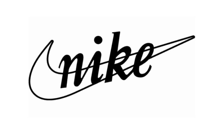
Each logo is a story for itself, and we can’t really say that there is a secret formula for making the perfect one. However, with the needed creativity and unique design, you can achieve some great results. When it comes to logos, an amazing example is the Nike Logo. It can be recognized anywhere, by anyone, and it is nothing more than a simple line in the figure of a “check” sign. Nothing overly-complicated, no tons of information or texts around it, yet it is still one of the most successful logos in the world. And this takes us to our next part, what to avoid when designing a logo.
What to avoid when designing a logo?
Simplicity and minimalism are the keys to success in today’s overly-branded world. So, if you are designing a logo for your business, brand or service, make sure to avoid including millions of items and information in it. The simpler your logo is, the more people will want to find out what it is, and actually, search for your product online. When it comes to designing, Turbologo is one of the free services which can help you out in learning a few things about the entire philosophy of logo-creation.

If you are designing a logo for a clothing line, the same things we just mentioned apply for this category as well. Nobody would really like to wear something that is overly-complicated and requires a lot of observing to be recognized or understood. Take a look at some of the most successful brands such as Lacoste or Tommy Hilfiger, their logos are so simple yet so attractive.
Things to pay attention to when designing a logo
Now that we mentioned some of the things that should be avoided let’s take a look at what can be potentially beneficial to your logo. After you decide what your logo will be used for, you can start your design by creating something that is really associating with the product/brand you are trying to sell.

For example, if you own a bakery, the logo can include a baguette or a deliciously looking donut. However, this is just an idea and something that logo designers tend to do, but it is not necessary. There are many logos that don’t remind of anything related to the product, such as the Nike one. Nothing really associates with clothing or shoes when you look at the “Check” sign, yet it is still an extremely successful one.
A thing worth mentioning is that you should never be trying to save any money when it comes to creating your logo. It is the only thing that people will recognize you from, and it needs to be designed carefully and by a professional. Think of it as an investment, because the better your logo is, the more your product is going to sell.
